StudyBuddy —
Peer Learning.
A community-based responsive web app that connects students to facilitate peer-to-peer learning, support, feedback and motivation — especially useful for those juggling studies with work, family, or illness.

StudyBuddy — responsive web app across desktop and mobile breakpoints
Enthusiasm is a key component of learning
Peer-to-peer learning can increase motivation and engagement with a subject. StudyBuddy is a responsive web app that allows students to connect with others in their field — to discuss topics, share insights, receive peer feedback on assignments, and find others willing to collaborate on projects.
The platform is designed to be especially useful for students juggling studies with a job, family, illness, or other commitments — bringing the right support to the right person at the right time.
Objective
Connect students online to facilitate peer-to-peer learning, support, feedback and motivation.
Designing for Alex
Alex is a student enrolled in an online course who works part-time as a retail store manager. He loves his subject but wants to complete his course as quickly as possible and gain marketable skills — all while managing the demands of part-time work.
"I love the idea of having the right support at the right time for my course, such as study materials and advice."
— Alex, primary persona
Mapping the paths through the product
Three primary flows were mapped: profile creation on first entry, search by subject/name/location to find study rooms and people, and the homescreen/newsfeed structure. Each flow was traced from entry point through to the key action — joining a room, connecting with a person, or posting to the newsfeed.
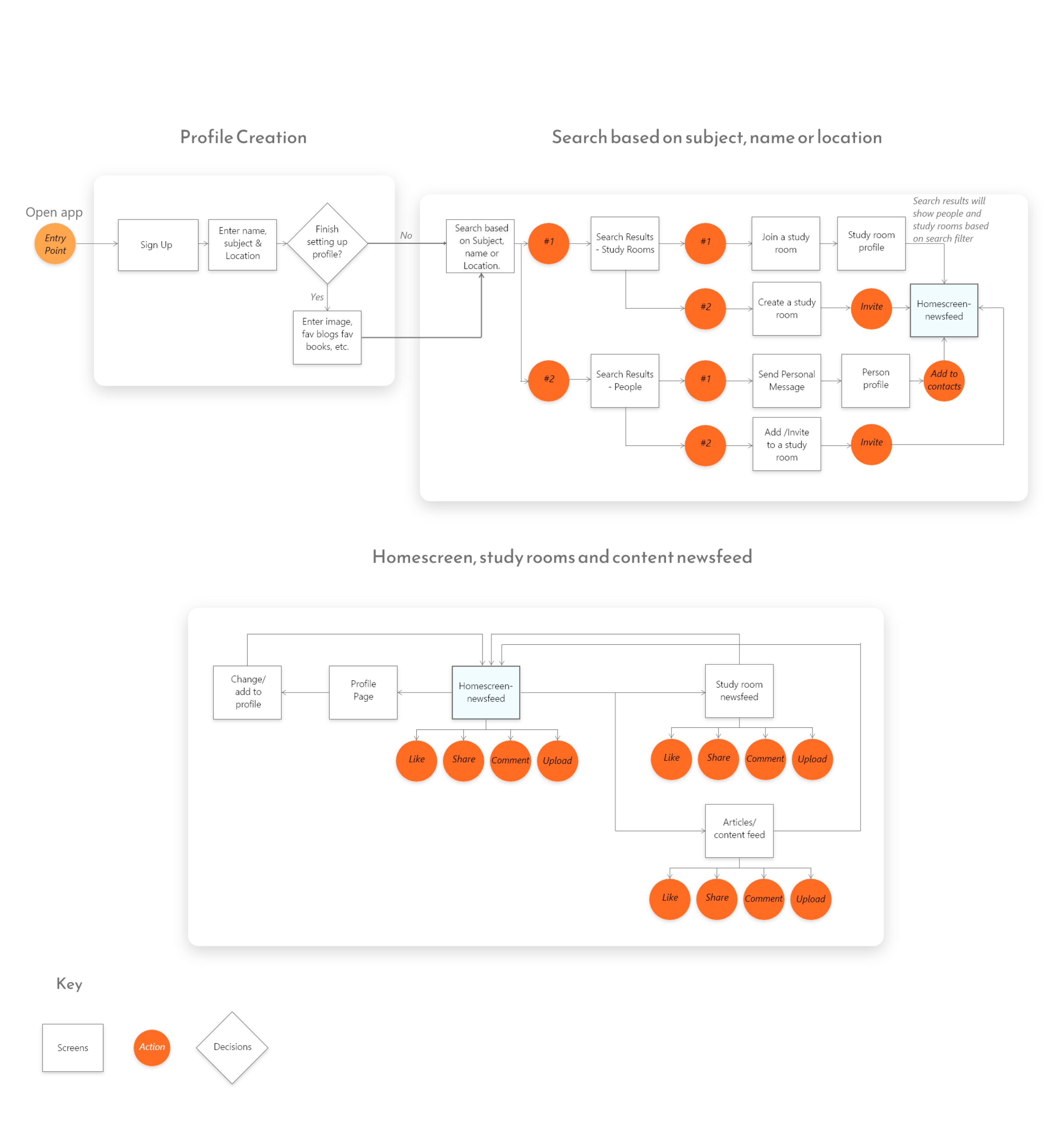
User flow — profile creation, search paths, homescreen and content newsfeed structure
From lo-fi to mid-fi to final
Wireframing progressed in three stages — low-fidelity sketches to validate structure, mid-fidelity greyscale layouts to refine hierarchy and interactions, and high-fidelity final screens with the full visual system applied.
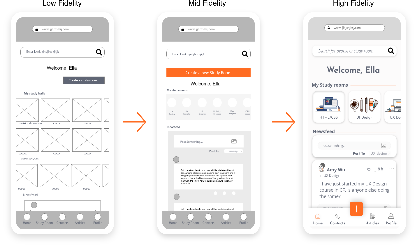
Wireframe progression — lo-fi structure → mid-fi layout → hi-fi final screen
Two directions. One clear winner.
Two moodboards were created to explore the energetic vibes of the product in different directions. Option 1 leaned into a cooler, more muted palette with blues, greens and purples — "We are Energetic". Option 2 pushed into vibrant orange with bright modern illustrations — "Enthusiasm is our buzzword."
Option 2 was chosen. The orange and bright modern illustration style better reflected the vibrant, energetic feel the app needed to evoke — and gave it a distinct identity in the edtech space.

Option 1 — cooler, more muted direction

Option 2 — vibrant orange ✓ chosen direction
One experience, every screen size
Students study everywhere — on a lunch break at work, on the bus, late at night at home. The app was designed across desktop, tablet and mobile from the start, ensuring the experience never broke regardless of the device in hand.
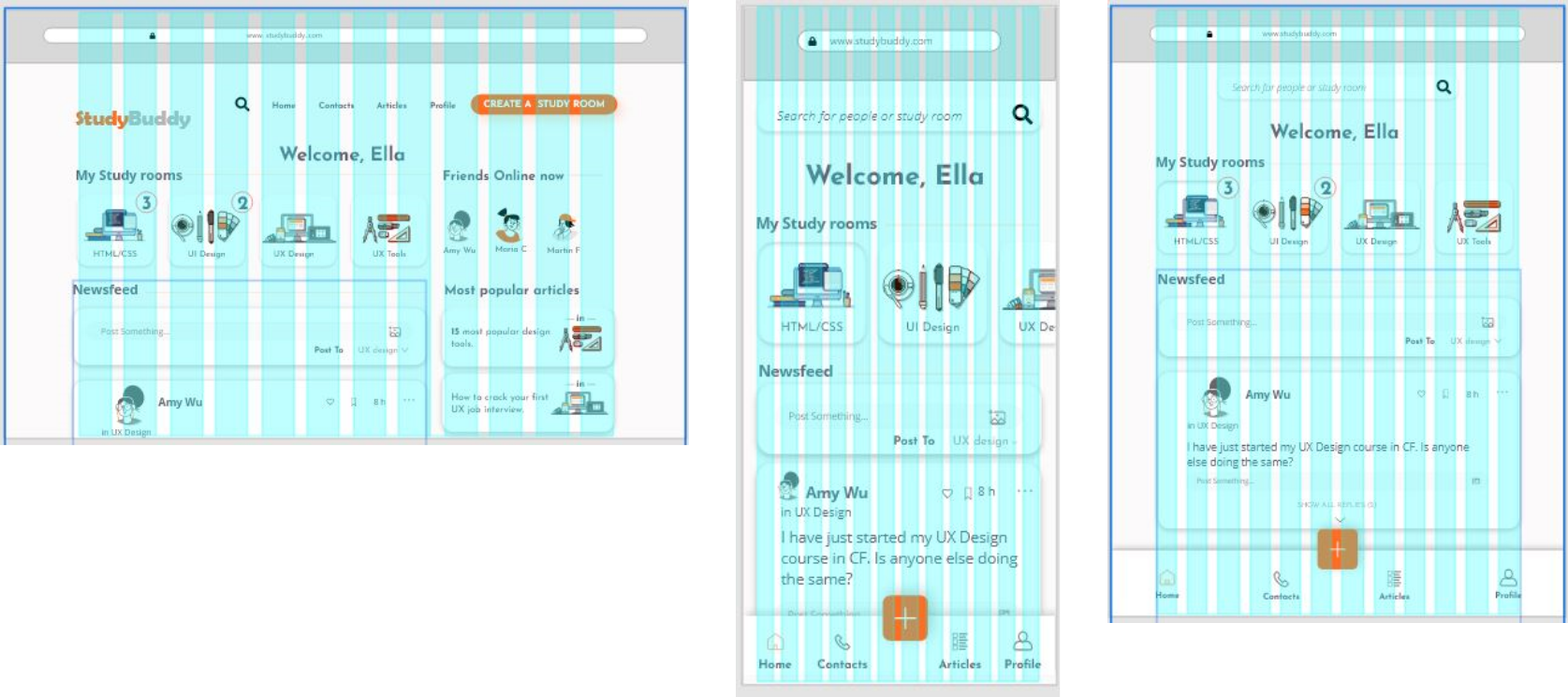
Wireframe-level breakpoint exploration — desktop, tablet and mobile
Final screens across all three breakpoints — consistent layout and hierarchy
The complete product
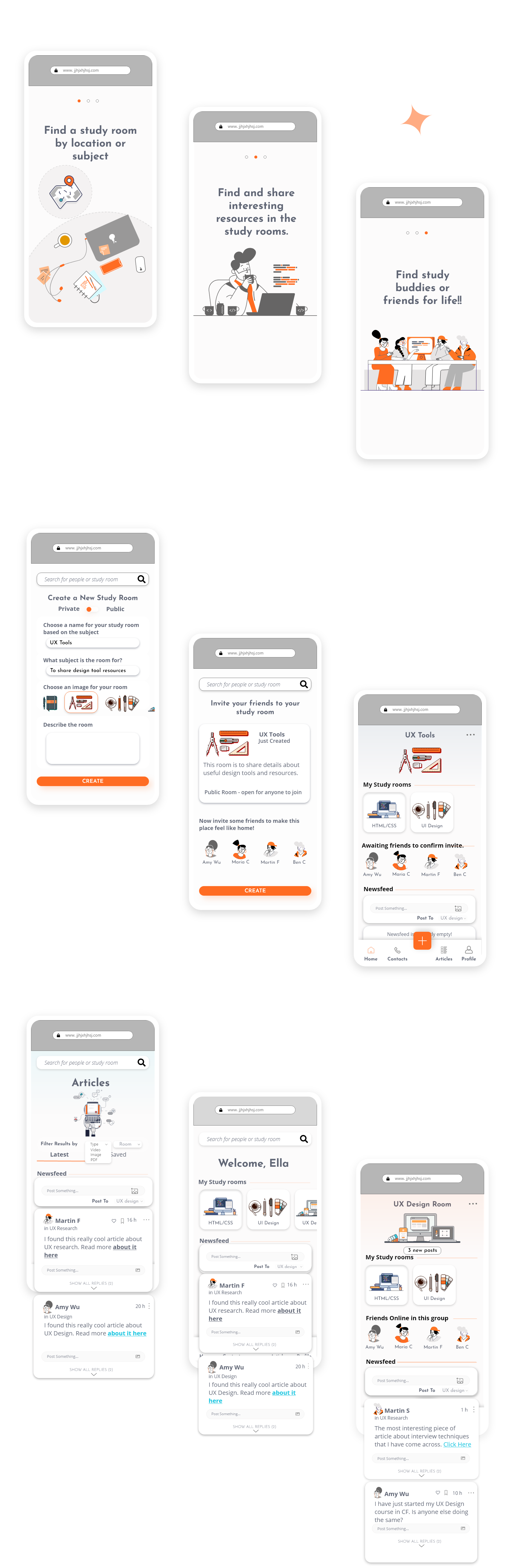
Onboarding — find a study room, share resources, find study buddies
Three onboarding screens orient new users: find a study room by location or subject, find and share resources in study rooms, and find study buddies or friends. The onboarding also covers the create a study room flow and browse articles experience.

Home — new user view showing study rooms, friends online and most popular articles

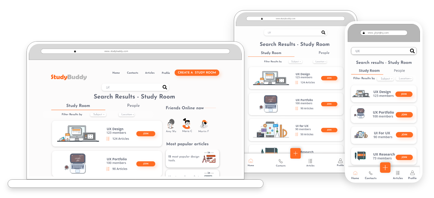
Search — study rooms filterable by subject and location, with a join modal on selection
The visual system
The colour palette centres on the signature orange, supported by navy blue, light blue, and neutral greys. Typography uses Jose Infons Bold for headings — strong and distinctive — paired with Open Sans Regular for body text to keep reading comfortable at length.

Colour palette (orange, navy, blue, neutrals) · Typography (Josefin Sans Bold + Open Sans Regular)
Full style guide → View in Adobe XD
What this project delivered
Looking back
This project was an early exploration of how community and social mechanics could make solo online learning feel less isolating. The persona work grounded every design decision — Alex's constraints around time and motivation shaped the adaptive home screen, the dual search model, and the newsfeed structure.
If I were approaching this now, I'd push further into the notification and re-engagement mechanics — the moments that bring distracted students back into the platform at the right time. That's where the real retention challenge sits for a product like this.