Website Redesign for
a Technical Product.
A full UX redesign for Glasswin — an aluminium doors manufacturer with a technically dense website and a non-technical audience. The goal: increase quote and contact conversions by making complex product choices feel intuitive.

Final prototype — homepage and product configurator on desktop
Technical content. Non-technical audience. Low conversion.
Glasswin's existing website presented a complex product range — aluminium doors with varying specifications, categories, and options — in a way that assumed technical knowledge the majority of their visitors simply didn't have.
Heatmaps and session recordings revealed the pattern clearly: users were not spending time on the product pages that would help them choose. The percentage reaching the "Build a Quote" page was very low, and even those who did weren't clicking the CTA.
Two specific challenges defined the scope of the redesign:
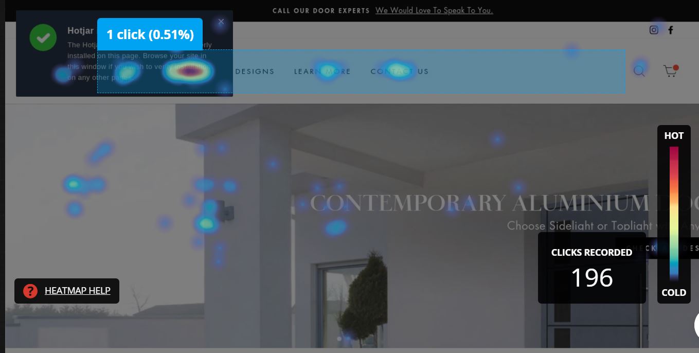
Heatmap data from existing website — users not reaching key product pages
Five phases. One month. End to end.
Despite the tight timeline, I ran a full UCD process — from competitive analysis and data review through to prototype and stakeholder testing. Each phase fed directly into the next.
I analysed five direct competitor websites, focusing on three things: information architecture, cognitive load for technical content, and user flow to conversion. This gave a clear benchmark for what worked in the category.
I then reviewed heatmaps and session recordings from the existing Glasswin site — identifying exactly where users dropped off and what they were ignoring.
From the research I defined three distinct user personas based on technical understanding and budget — each requiring a different path through the product range to reach conversion.
The sitemap was restructured to reflect updated product classification and reduce the distance between landing and conversion. New article content was planned to support SEO and educate non-technical users before they reached the product pages.
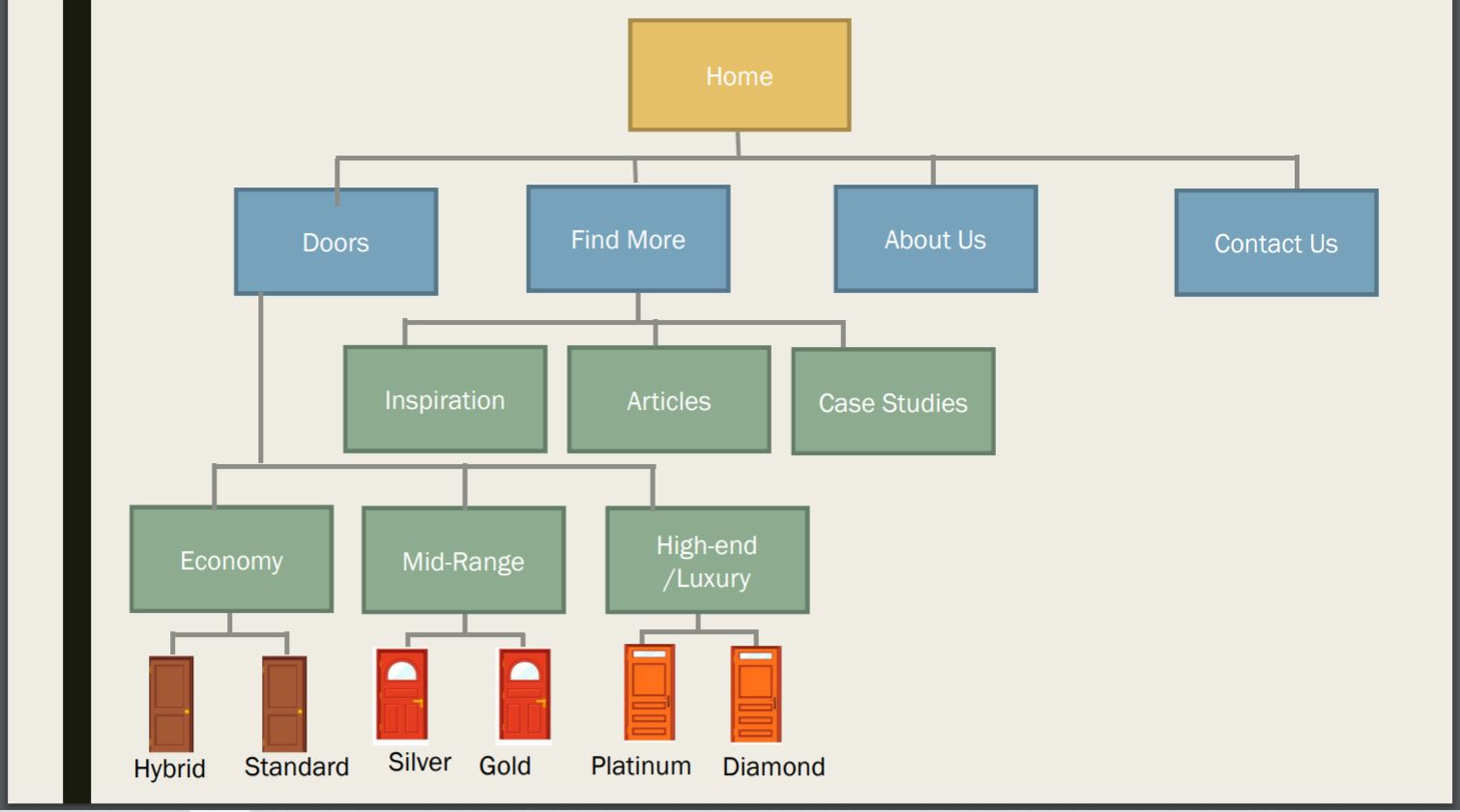
Updated sitemap — cleaner IA supporting all three personas to the CTA
Wireframes were built for the homepage and product pages, layering information from simple to detailed so each persona could navigate at their own depth.

Wireframes — homepage structured to guide all three personas toward conversion
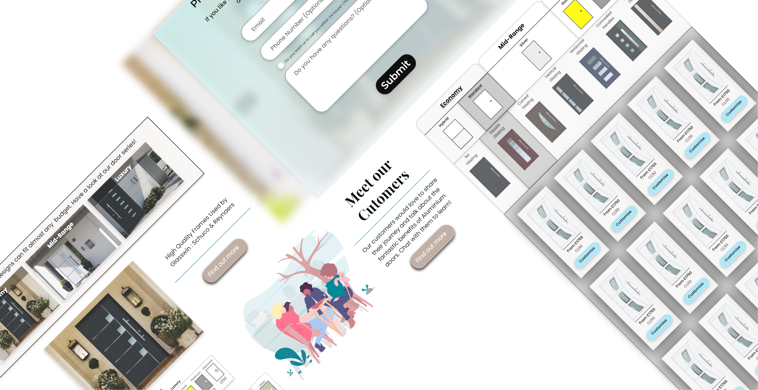
The final prototype included a fully redesigned homepage, product pages, and the visual configurator. Each selection in the configurator was immediately reflected in a live preview — removing the need for technical imagination.

Interactive prototype — visual configurator with live product preview
A first round of testing was completed with stakeholders. The configurator went through several iterations to reduce the number of steps and make the flow faster. A/B testing on the configurator CTA was planned for post-launch to further optimise conversion.
Designing for three different minds at once

Redesigned homepage (left) and visual product configurator (right)
One redesign. Three audiences. One CTA.
The final deliverable was a complete redesign of the homepage, product pages, and configurator — supported by an updated IA, a new design system, and a fully interactive prototype ready for development handoff.
The homepage was restructured so that all three personas could navigate to conversion via their own natural path — without the site ever feeling dumbed down for one or too technical for another.
The visual configurator transformed what had been a form-filling exercise into an engaging, visual product-building journey — increasing confidence in the purchase decision before the CTA was even reached.
Final product pages — built to convert across all three personas
End-to-end delivery. In one month.
As sole designer on a fast-moving freelance brief, I delivered a complete UX redesign — from research through to prototype — within a single month. The project went into development with A/B testing planned for the configurator CTA.